

Creating a New Space for Beautiful Old Things
From side hustle to cult following—crafting the visual world of Sylvie

Most great businesses begin as solutions to personal frustrations. That's certainly how Sylvie started.
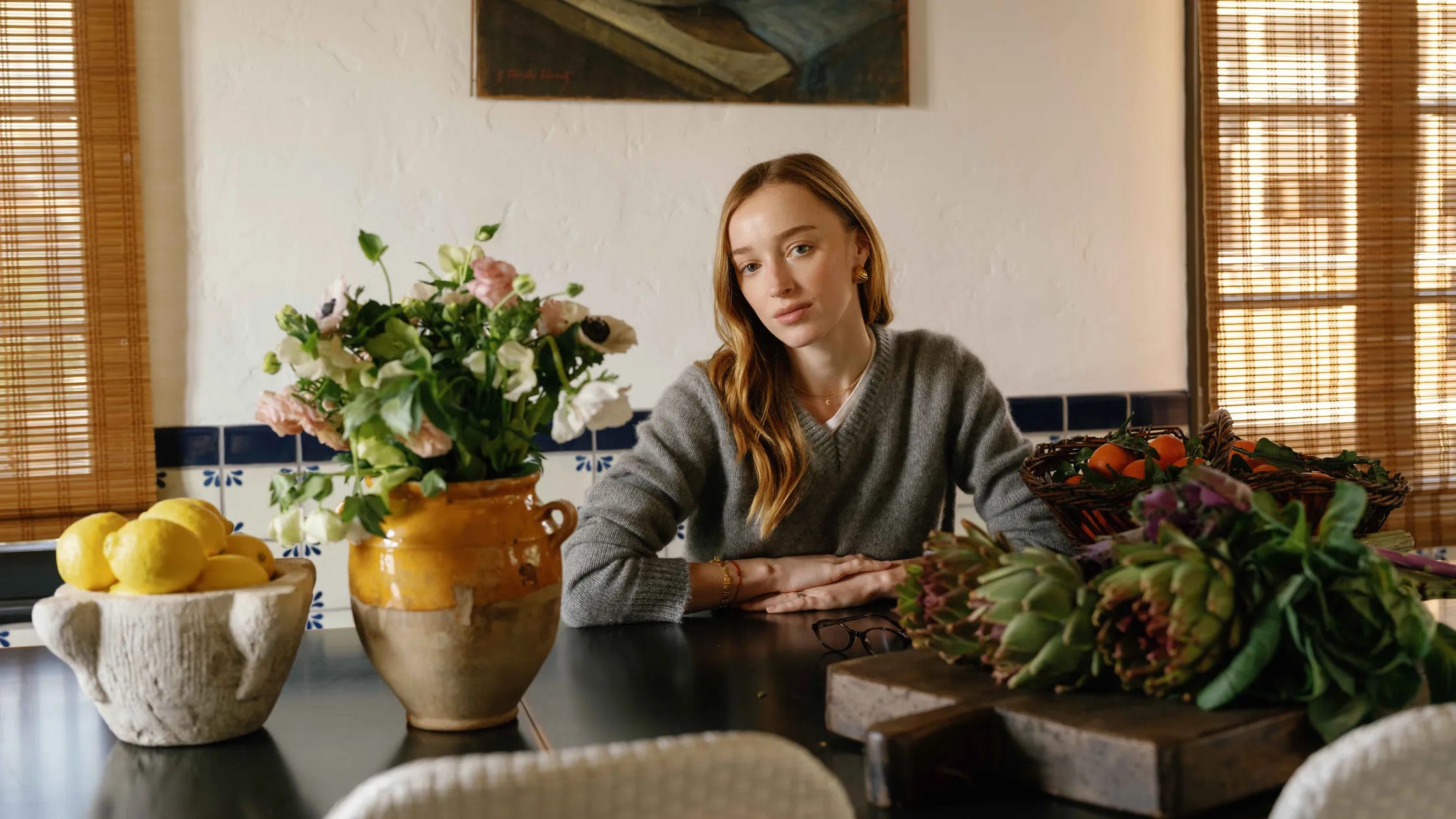
Chelsea Macdonald, an entrepreneur I met through a mutual friend, was turning a side hustle of selling carefully curated vintage furniture through her personal Instagram into a scalable company.

She had built a passionate following doing so, and her initial success had revealed something fascinating, though blatantly obvious: the vintage furniture market was fundamentally broken. It was opaque, fragmented, and often frustratingly inefficient.
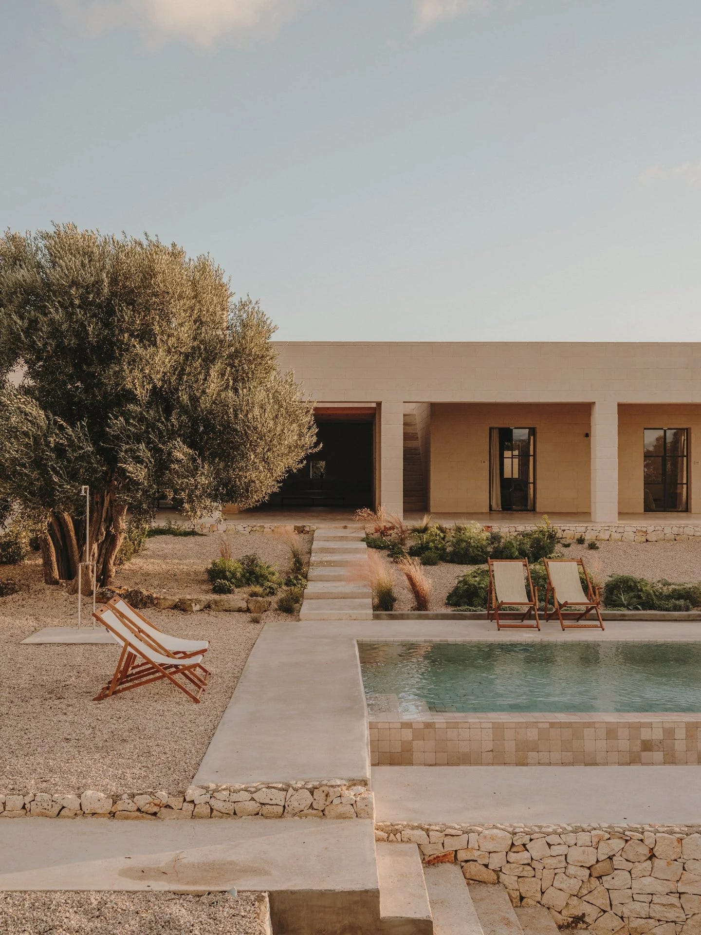
Chelsea and I connected instantly over a shared passion for design and interiors, specifically our mutual admiration for Studio Andrew Trotter, whose aesthetic perfectly encapsulates the imaginary Ibiza estate that lives permanently on my mood board. (Someday, soon, it won't be imaginary……)
She’d already spoken with a number of talented agencies, peers we admire. But when we spoke, something clicked. There was mutual understanding and mutual trust.
We agreed to take the leap together—to build a modern-day estate sale. The timeline? Blisteringly fast (yet energizing). The ambition? Huge. The vision? Crystal clear.
That alone put this project two or three standard deviations outside the norm. Those are usually the ones worth doing.
With fresh support from Baukunst, a venture fund founded by a collective of creative technologists advancing the art of building, it was time to build.
We kicked things off with research. Foundational, non-negotiable. Nikita Walia—our strategist, selected for her cultural instinct and borderline encyclopedic enthusiasm for furniture—led deep dives with Chelsea, consumers, vendors, and industry insiders. We needed to know the landscape cold: the pain points, the inefficiencies, the hidden opportunities.
We listened closely. What emerged was a new story about how people really furnish their homes today—not just with functionality in mind, but emotion, character, and curiosity.

We explored conversations around dupes, sustainability, and the rising desire for pieces with provenance.
The modern buyer isn’t just shopping; they’re curating. They want something rare, with a story to tell.
Those insights became the bedrock of Sylvie.

Clarity in hand, we entered the design phase with strong conviction. The vision was clear, sharp, and purposeful.
Usually, we explore three or more visual territories. This time, we needed only two. The strategic direction was so pointed that anything beyond that would’ve been noise.
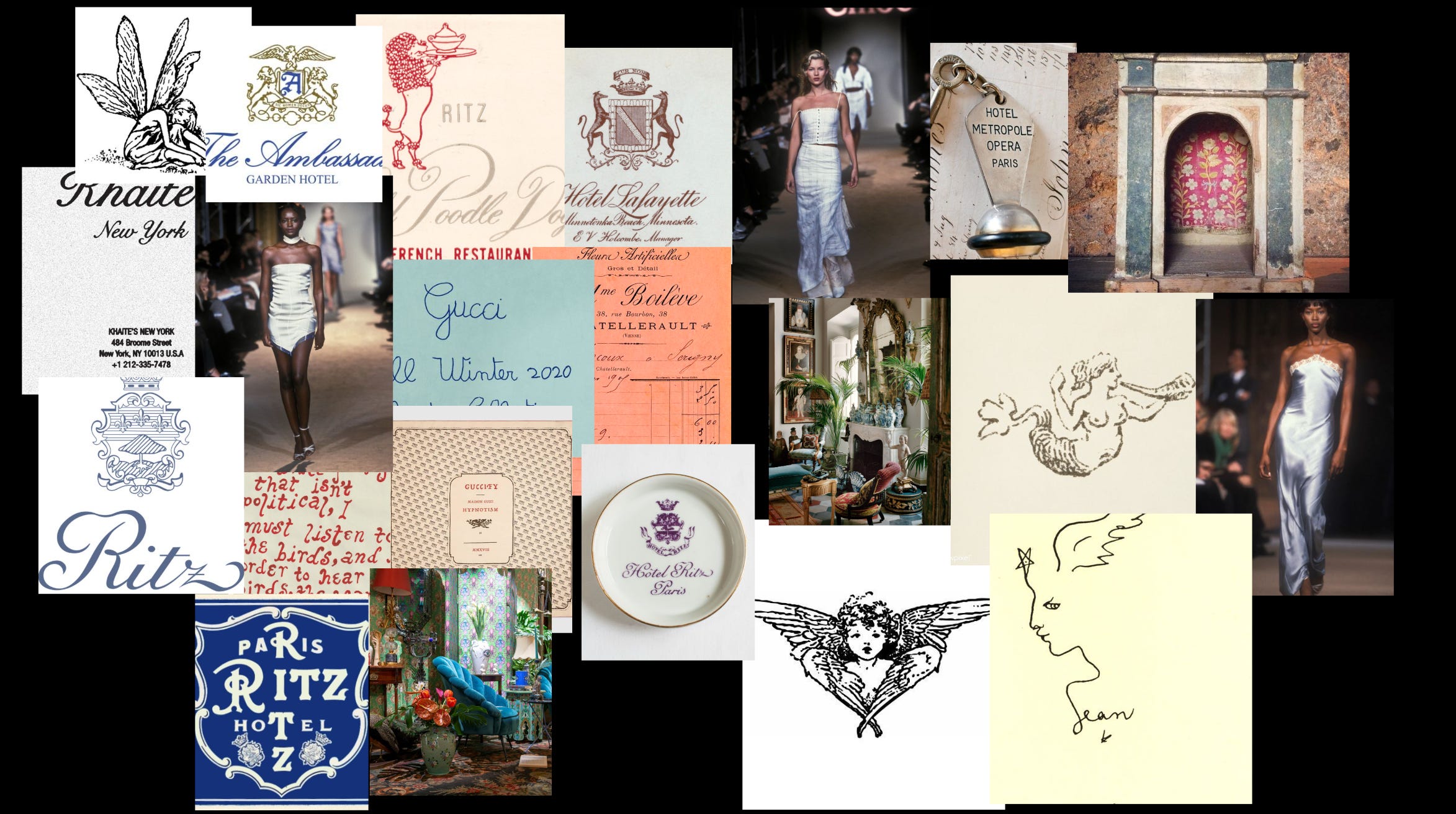
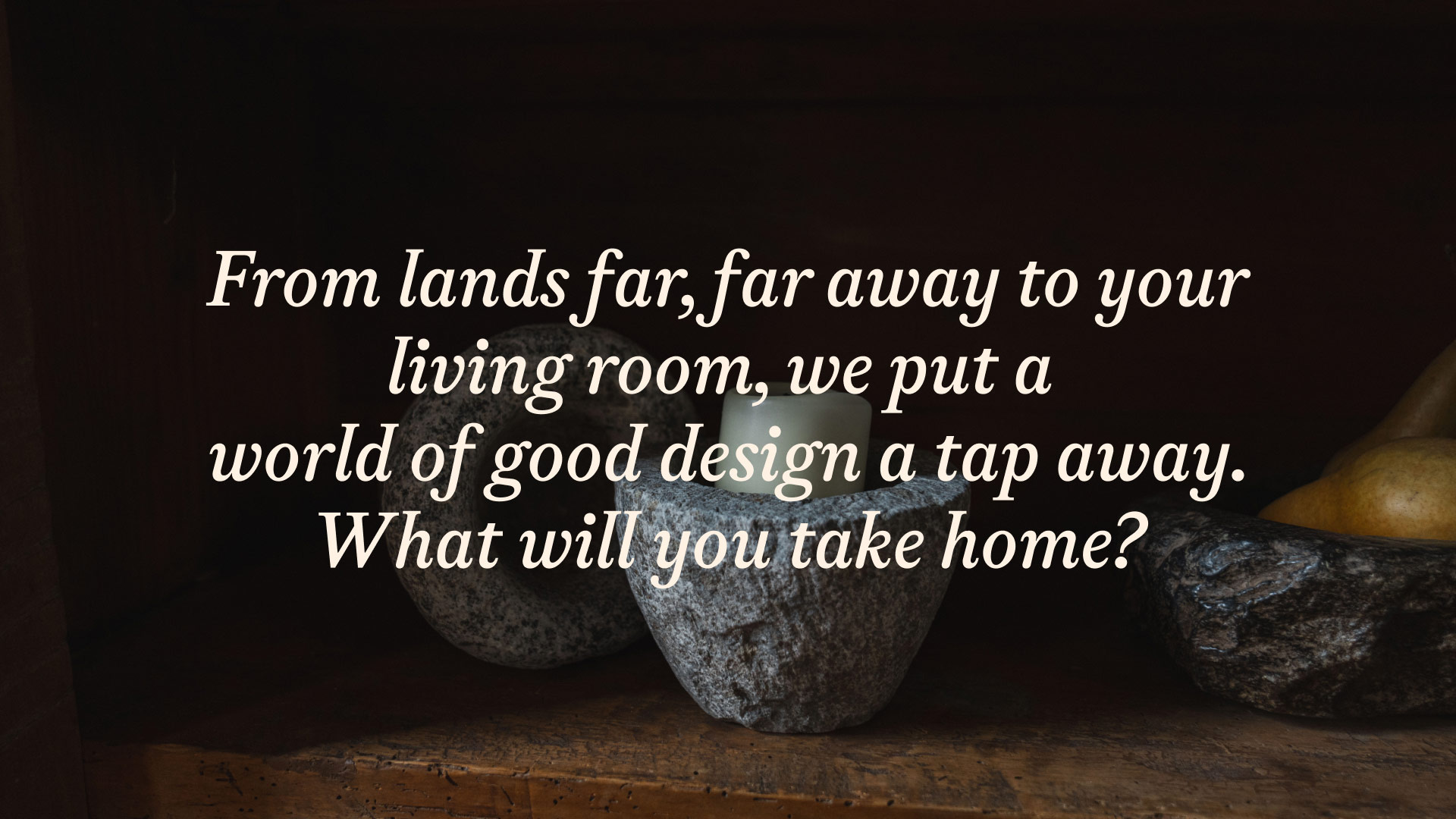
We were inspired by a dreamy world built on love letters, vintage hotel culture, feminine mysticism, and sun-faded nostalgia. A sensual palette of soft textures, whimsical illustration, and historical references—equal parts decadent and delicate.

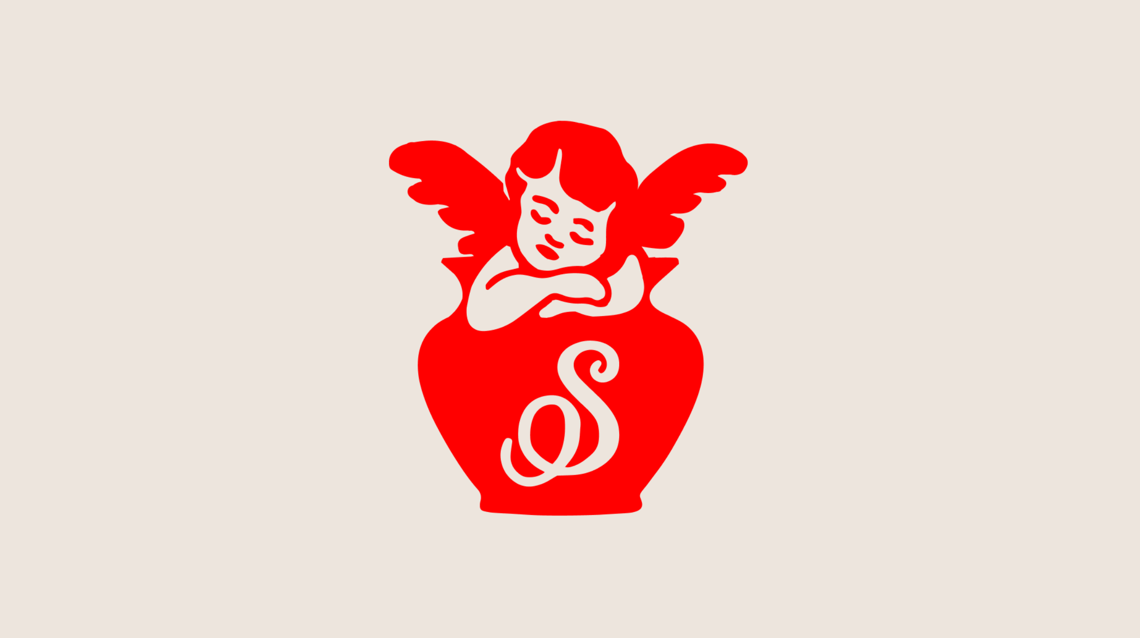
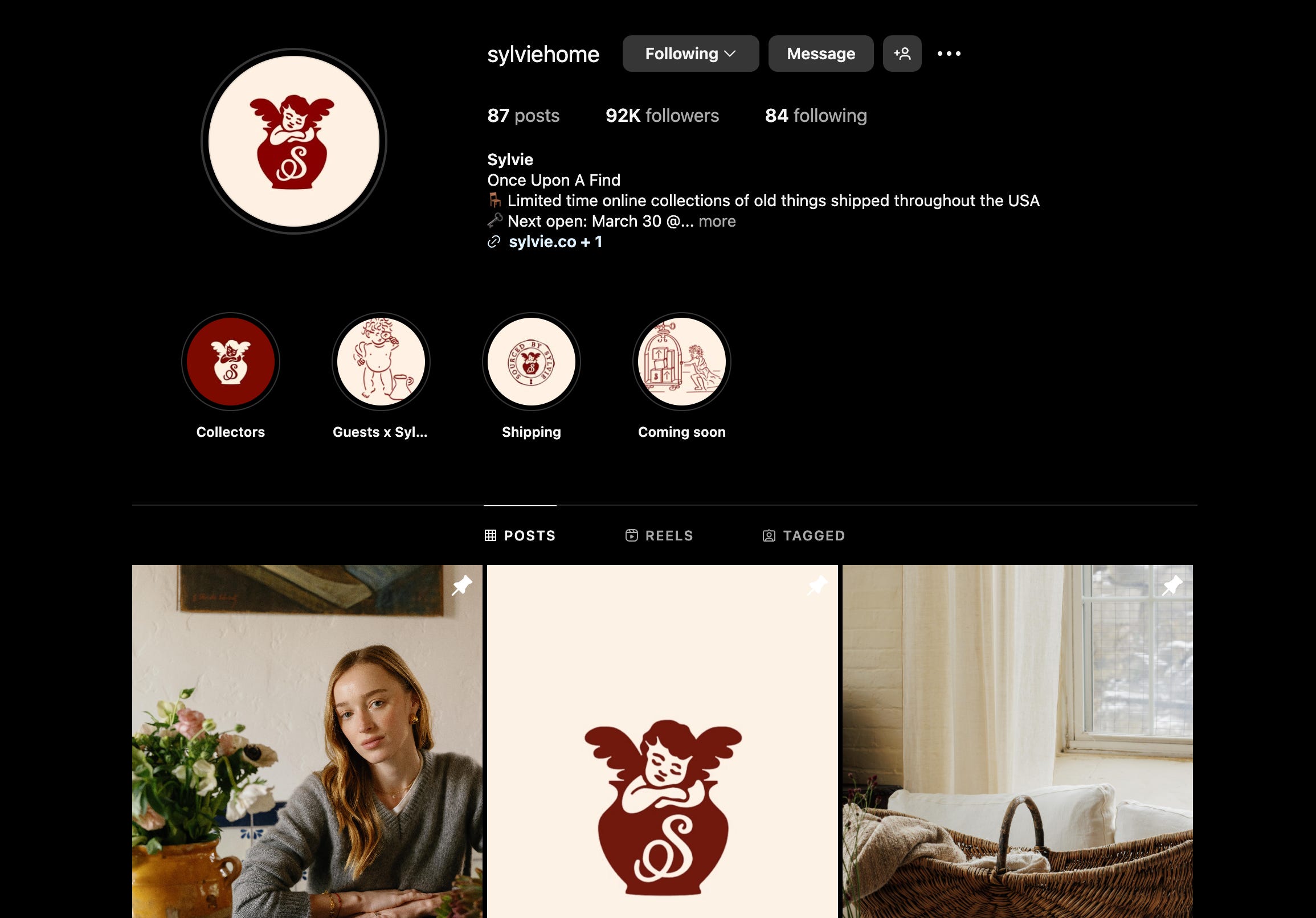
From early on, we knew Sylvie needed a mascot. An archetype. Something magical. After all, what Sylvie was doing was kind of magical—sourcing rare treasures from far-off places, somehow priced within reach.
We got to work drawing.
Enlisting long-time collaborators Simon and Zander Abranowicz to help us bring this to life through thoughtful, high-caliber design, we landed on a cherub (but not after first trying a dog…)
The cherub, Sylvie, would be lounging in a clay pot. Nonchalant, half-asleep—probably after a long day scouring markets in some faraway land. You couldn’t blame the poor thing.
We loved the illustration.
But the red tone felt off.
It didn’t carry the richness or depth we needed to balance the whimsy.
So we tried dozens of shades.

Eventually, we landed on “Oxblood.” It had that perfect tension—playful and sophisticated.
With this Cherub icon as our anchor, we started building the Sylvie wordmark.
There was already an “S” elegantly laid out on the front of the cherub’s pot—it felt instinctive, as if it had been there forever, lost in time. The rest flowed naturally. We expanded that sketch into a custom wordmark that felt personal, elegant, and hand-touched.
Then came the world-building.
If Sylvie was an estate sale, she had to live somewhere. A place with rooms. And secrets. And keys.
It needed a key.
We designed a custom estate key as part of Sylvie’s identity—a symbol of access and rarity.
The idea was simple: you don’t just buy from Sylvie.
You gain entry.
The things she sources aren’t mass-market. They’re found in small numbers, released at specific times.
When they’re gone, they’re gone.


So the lock and key became a motif. A way of signaling that what’s behind Sylvie’s doors is special—worth unlocking.
And just like that, the modern estate sale had a name, a soul, and a set of keys.
Sylvie is very narrative and illustrious in the way it communicates, so we wanted a type that felt maybe not entirely far from being ripped out of an old book. Dinamo had the perfect choice, Gaisyr.
Dinamo themselves put the tone of this typeface best—
“Just close your eyes and imagine the King sitting in his garden, a bit sunburned, surrounded by butterflies and low-hanging citrus fruit, sipping on a glass bottle of Coke®.”

We use Gaisyr throughout—headlines, body copy, product descriptions, even the fine print.
It’s elegant quirks and historical undertones give Sylvie a distinct narrative voice that feels both timeless and slightly enchanted.
It almost feels pulled from the pages of a well-worn novel.

To bring balance to the typographic system, we introduced Inter as our functional counterpart to Gaisyr.
Inter does what Inter does best—it disappears.
Clean, legible, and quietly confident, it allowed the soul of Sylvie to sing while carrying the digital backbone with grace.
It reminded us that Sylvie is, at its core, a piece of modern technology. But like all good tech, it’s invisible when working well—simply a conduit for magic.

As we developed the collateral system, we drew from the ornate moldings of French Haussmann architecture—richly detailed, sophisticated, and timeless.
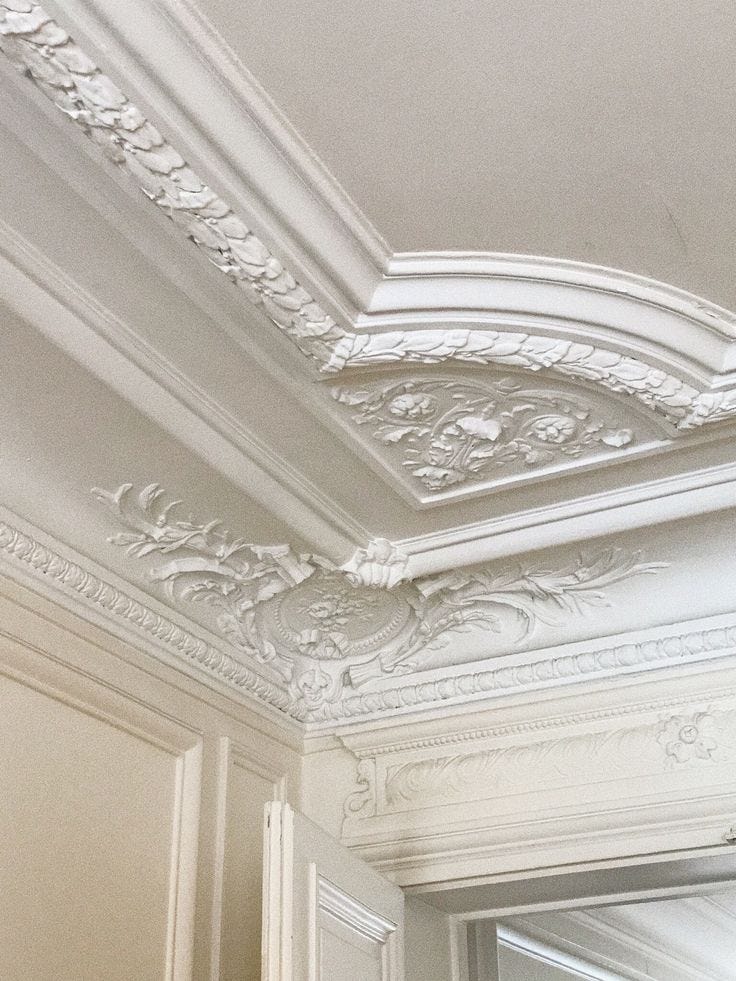
That visual language became the basis for a modular system applied across Sylvie’s physical and digital touchpoints.
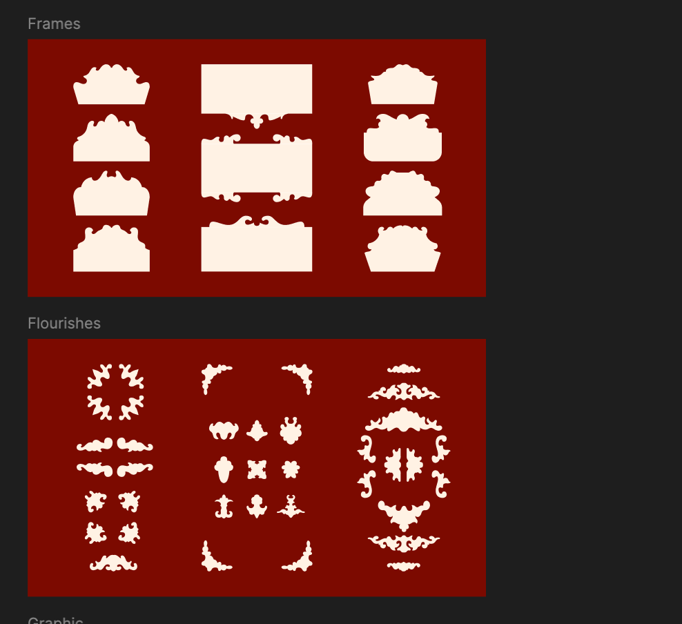
These weren’t just flourishes. They were a reminder of Sylvie’s deeper philosophy: to live beautifully in the everyday.
We also created a library of custom icons and placards to represent the distinct eras and objects Sylvie curates. Each one is like a stamp or sigil—a small symbol of the provenance, craft, and character that defines the brand.

These helped us bridge function with feeling, anchoring the shopping experience in clarity while keeping the dream intact.
And in motion, the dream truly came to life.
Adam Garbutt brought a sense of absolutely meticulous whimsy to Sylvie’s animation language—each interaction, transition, and flicker of movement crafted with care, elegance, and a quiet sense of magic.
All of these pieces—the cherub, the oxblood, the estate key, the type, the moldings, the modules—they weren’t just design decisions. They were attempts to answer one question:
How do you build a brand that feels like a love letter, not a storefront?

And in the end, that’s what Sylvie became.
Not just a marketplace, but a place.
A portal.
A little bit magical, a little bit mischievous, and deeply personal.
What began as one founder’s frustration turned into something far more powerful: a new way to furnish a life—with story, with soul, and with style.
Sylvie isn’t just about the objects. It’s about that rare, electric feeling of finding something that feels meant for you.

The quiet thrill of discovery. The emotional charge that happens when you recognize a piece of yourself in something from another time.
That feeling proved to be contagious.
What started on Instagram quickly gained traction—first through word of mouth, then through an ever-growing collective of design lovers, aesthetes, and tastemakers. Today, Sylvie commands a devoted and fast-growing social following, with collectors, celebrities, and enthusiasts all watching closely for each drop.
One of those fans? Bridgerton star Phoebe Dynevor. She collaborated with Sylvie on its first celebrity-curated collection, an edit that embodied her graceful, romantic aesthetic.
The hype around the collection was an instant success—and was recently spotlighted in Architectural Digest, cementing Sylvie’s position at the intersection of cultural relevance and timeless design.
And really, that’s what makes Sylvie special.
It doesn’t chase trends.
It creates space for personal expression.
A new kind of estate sale.
A new kind of brand.
And maybe, if you’re lucky (and you find the key), a new kind of home.
A heartfelt thank you to the exceptionally talented team who made bringing this vision to life not only possible—but beautiful:
Produced at Handstand
Adam Garbutt
Chelsea Macdonald
Christine Balistreri
Fabian Fohrer
Ivona Stefanova
Maria-Viktoria Kuzmanova
Nate Brown
Nikita Walia
Simon Abranowicz
Stan Kirilov
Tynan Sinks
Zander Abranowicz
Baggy Studios
Your craft, care, and creativity are embedded in every detail. This one was special—and it wouldn’t have been without you.
Appreciated this type of breakdown behind the process. Excited to see more. ✨
Really enjoyed this peek behind the curtain Nate.